Illumenation Tactics – The Design Brief
ILLUMENATION TACTICS is a new South Florida productions company, specializing in production lighting design and corresponding creative services such as photography and videography. When Illumenation Tactics contacted us, they were at square one, without even a name in mind. After sharing their passion and vision for their new company, the research and creativity began!
OBJECTIVE
Our objective was to create an edgy brand identity that represented both the lighting design as well as the photography/videography aspects of the company. This was to be achieved first through a clever business name and clean logo design and then through a consistent, modern, and high-contrast brand design.
THE STARTING POINT
BUSINESS NAME & LOGO. With this particular client, the design process started with creating a clever and catchy name. We started by creating a text-based mood board, filled with dozens of adjectives describing the company, their services, and industry-related terminology. This mood board helped identify the clever play-on-words that ended up becoming the company’s name. Combining the word ‘illumination’ (which can reference both lighting design and photography lighting) with the word ‘lumen,’ (which is a unit of measurement of light) the name Illumenation Tactics was born!

After we established the company name, we moved on to creating the most essential aspect of any brand – the logo. We wanted to create a logo that included an icon, but could also be separated into a two stand-alone elements — a text-based logo and an icon. Additionally, we decided to use color to bring notice to the play-on-words and add a feeling on contrast that would translated into every design element throughout the entire brand.
NEXT STEP
PRINT MATERIALS. With the logo and color scheme finalized, we moved on to the next step, which is where the true essence of branding begins. One by one, we started to create the basic print materials needed to start a business — business cards, letterhead, and envelope. Although these pieces are generally simple and seem trivial compared to larger design items, these three print materials form the basis from which the entire brand identity is created. In creating these materials, we used several design elements to create a cohesive and identifiable brand — high-contrast colors, the overlay of a semi-transparent icon, and the consistent use of fonts and colors among each design.


DIGITAL MATERIALS. There are many digital aspects that are needed for the success of a business, including a website, social media pages, email marketing, and perhaps some online advertising. Of these, social media is one of the most ineffectively used and underestimated digital aspects of a brand. The power of social media and the potential it has to grow your brand is enormous. For that reason, we always include a couple basic digital materials in every branding package. For Illumenation Tactics, we created a social media template, perfect for posting quotes, and a Facebook banner.


FINAL STEP
BRAND GUIDELINES. In order to maintain a consistent brand, we like to create a brand book for each of our clients. Having brand guidelines ensures that your brand’s identity is unmistakably visible by everyone that comes in contact with your brand.

Thank you Illumenation Tactics for entrusting us with your creative dreams!
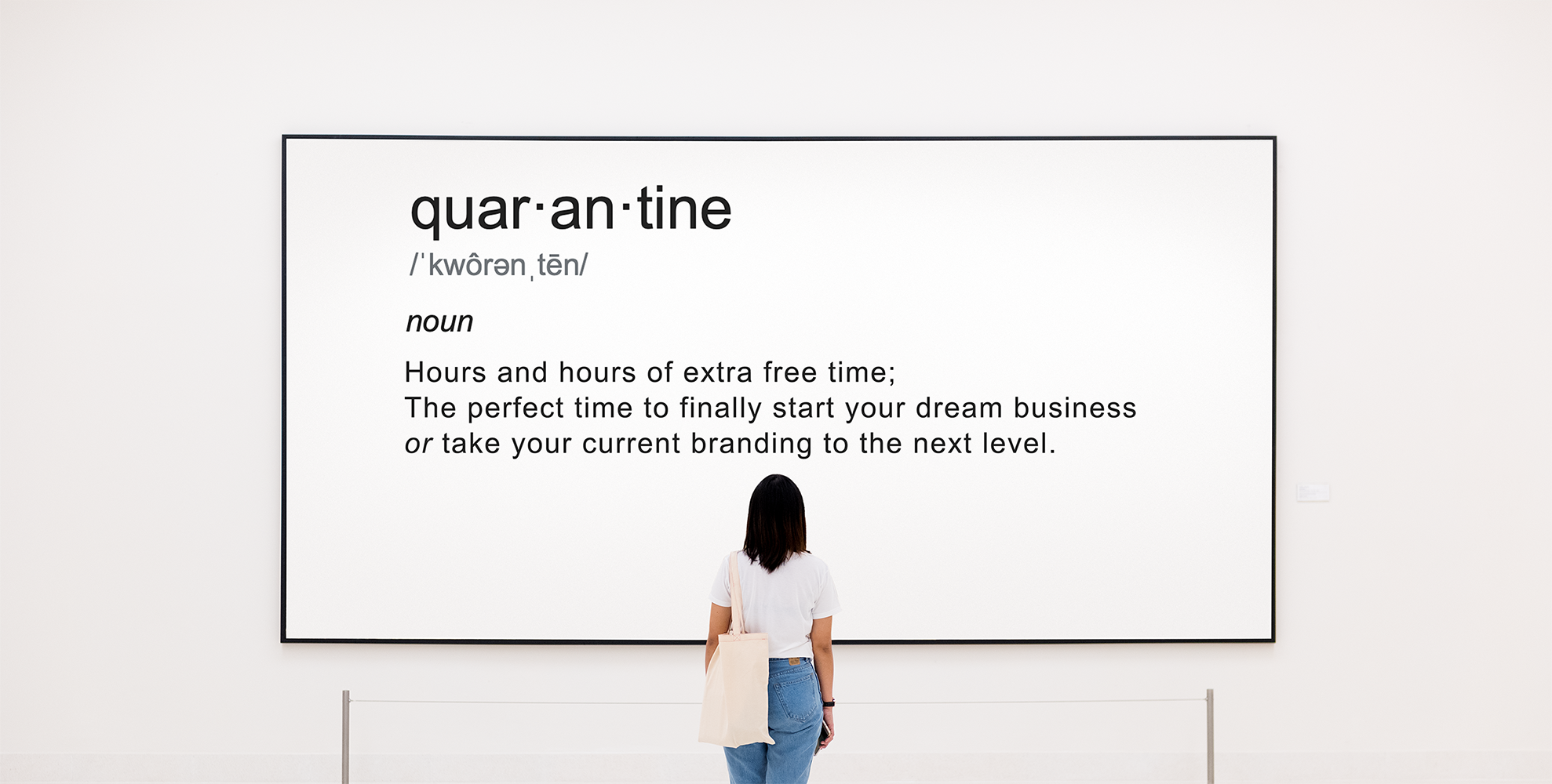
Are you in the process of starting a new company?
Is your current branding outdated and screaming for an upgrade?
Check out our Complete Logo & Brand Identity Summer Special.